-
 This brief was to create your own corporate identity. I started with researching into other logos and comparing them. I also looked at colour and symbol meanings.
 I then went on to sketching some of my own ideas, using different colours. I read in a Computer Arts magazine to not be afraid of using your name or initials so I created ideas with using my initials. Also my last name 'Sharp' worked well for Sharp Designs.
 These are some more ideas I went on to develop in Illustrator, the two s' together flipped gave a love heart in the negative space so I used the direct selection tool to join them together to create a full heart.
 This was my final idea, I sketched out two linking S's, using different colours and finally creating it on the computer using illustrator. I decided using black looked too harsh and thought grey looked better, I chose the purple underneath as I think it looks feminine and represents myself also the colour purple means a few things such as creative, wise and independent representing myself as a designer.
 I created many letterheads, business cards and compliment slips, these were my finals. The purple line worked very well with my logo and stuck on the designs of these corporate designs.
 These are a few promotional items I tried out with my logo on
 I was also asked to create a creative CV for this brief and the first thing that came to my head was a fortune teller. Here are a few screenshots of how I created it.
 I added my logo, important details such as qualifications, contacting me, my skills and my hobbies.

 I created a book on all the work I had done for this corporate identity brief using Blurb.
-
For this brief I had to create an article to show how computers are used in Art and Design, I have shown some of the work I created for this article in other posts. These are some of the research side I added for the topic computers.
 I talked about the 3D printer and how it can print anything made out of plastic, nylon and metal. Something I talked about in my article was how this printer made a new limb for a guy, allowing him to pick up stuff by attatching a hand to his arm. Something else I found interesting was the plastic gun that made the news.
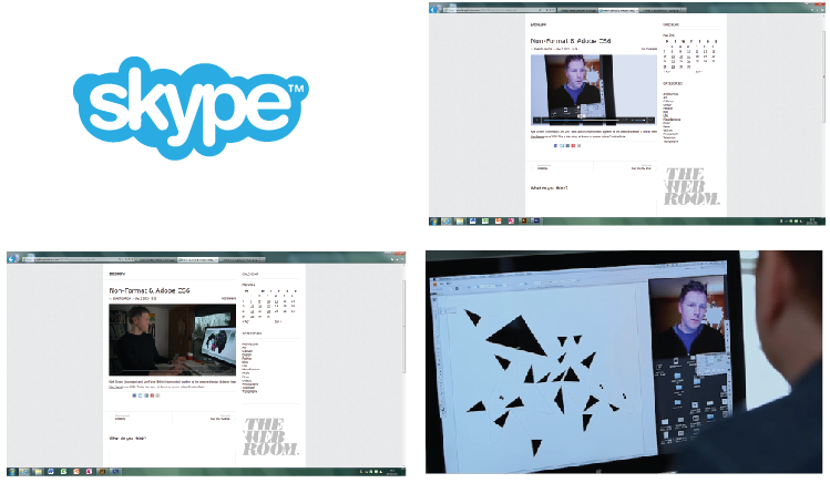
 This is Non Format, I talked about how these artists are in different countries and use skype to communicate and send work to each other to tweak themselves.
 These are some layouts I looked at to inspire me for my article from Digitial Art magazine.
 This is my final article including some work I created, some artists work I really liked and some interesting points that were associated with computers.
-
 This work was inspired by Paul Blow and was created for a brief to show how computers are used in Art and Design. I clicked on about Paul Blow on his website and found this image of himself that had been manipulated, I thought this was an easy and fun way to show how computers are used for Graphic Design.
 I started by taking a photo and taking it in Photoshop, these are my screen shots of what I did, which shows me using the clone tool, rectangular marquee tool and skewing the photo.
I changed it to black and white like Paul blows photo however I decided it looked better in colour.
-
This work was created in my own time, typography is not my strongest field of Graphic Design so I thought I would try and experiment and further develop my skills. I started by creating an oragami ball that was inspired by hvass&hannibals work 'ghost of a chance'
 I then used photography, using a white sheet as a background and having a light projected at the object. I took lots of photos and this was the one that looked the best.
I clipping masked areas of the oragami ball to create letters, I came up with the word knot because I could see the letters in the ball straight away. I liked the way you can see my hand holding the ball.
 I used photoshop hue/saturation to change the colours and make this piece of work look more interesting.
-
 These are a few artist copies of David Hockneys work. I chose to do these specific paintings so that I could get used to creating facial features. I also decided to draw Albert Einstein as this famous photo of him, he is pulling a face which helped me get the face features in the right place and also helped me get used to drawing older faces for my final.

 These are some close ups of my work.
 I also went on to draw eyes and hands. I drew women and men eyes of different ages which helped me for my final piece. These were created in pencil and biro.
 This is my final piece of my Great Grandad created using acrylic paints.
-
This is an example of work for a brief that was set in college, I had to show how computers are used in Art and Design.

This is one of the designers I looked at and was inspired by called Alvaro Tapia. I like how the face and body have the same shades however the nose and mouth stand out by using contrasting colours. I wanted to create my own, I did this to show how he would have done it and show that he wouldn't have got this effect by not using a computer.

These are screenshots of how I made this illustration, I first started with Photoshop to see if there was any effects I could use however this didn't work, I then took the image into Illustrator and used the pen tool sectioning off parts of the face then finally using colour.

-

 This was a 'Still life' project i completed in high school GCSE Art. The artist I was inspired by was Cezanne and the painting on the right is an artist copy I did of one of his pieces of artwork. I used acrylic paints for this piece. The work on the right is work I created in still life style, it shows a range of mediums I used through out this project such as photography, colour pencils, acrylic paints and ink wash.
 -
This brief was called 'Mixed Media Image Making' with the subject Urban Scene. I was approached to create a double page spread using my final Urban Scene design. This is how I tackled the brief.I started off by researching artists that use a range of traditional and none traditional techniques such as Neasden Control Centre, Non Format, Julien Vallee and many more which helped and inspired me for some of my designs shown further on.
 After researching artists I went out to take some of my own images which could be used in my designs. These are a few of the images I took. My images were took in Leeds, Middlesbrough, Wakefield and London.
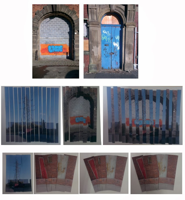 I used these photos to create collages. I used a guillotine to cut these images up leaving space between them, mixing the two images together or pushing them closer together to make them look distorted and more interesting.
 This is a piece of work which was inspired by one of the artists I had researched - Neasden Control Centre. This was a perfect artist to base work around as their work is very urban with their sketches of streets and citys. I decided to sketch out one of the photos I had took in NCCs style.
 This was something I found very interesting and caught my eye whilst walking streets taking images. I took a photo, sketched it out and also researched about tagging and graffiti, then looked into Banksy.
 I loved the tag so much I created my own design, taking a photo of my friend and using image trace on Illustrator deleting some of the black space so i had minimal features.
 I printed this out and created a stencil by using a scalpel. I then used spray paint.
 I also used the stencil with the spray paint outline and put different materials behind it such as coloured paper and brick wall that I took a photo of myself. I also used different coloured paints.
 I took my designs into Photoshop and tried different effects to make it look like it was actually spray painted on the wall. These were my final designs which were going on my article.
-
 This was a mock exam, you were able to choose which topic you wanted to create your work on. I chose to do a landscape through a window or doorway. The artist I chose for this mock exam was Rene Magritte as his work had images through an image. These are some of my artist copies using acrylic paints and oil pastels.
 I came up with the idea of looking through a key hole, i took my own image of a keyhole however it didn't work very well. I had images i took myself of a hot air balloon at a theme park and thought the contrast of the bright blue sky through the dark grungy door would look great making the image stand out.

This was my final piece created in acrylic paints. -
This is some of my Lowry paintings I created in GCSE Art. Above are the paintings I created using acrylic paints, underneath are the photos that Lowry painted.

-
This was created for a competition that was ran for students to create the 2013/2014 Wakefield college planner. I decided to sketch out letters to look like pencils, I then used a fine liner so that the scanner would pick the type up. I then scanned it into the computer and opened it on Illustrator.

 I image traced my sketch and tweaked it so that it was neater and then used colour. I then added what looks like graph paper as the background as that relates to a material used at college. I tried different layouts:
 This work is shown on my college subject website created by my tutor which can be seen here http://btecgraphics.co.uk/
-
These illustrations were inspired by a designer called Ben the Illustrator. This was a task set to create your own animals showing you were inspired by this illustrator. They were created by using the pen tool on Illustrator to create shapes, changing the opacity and then layering them over each other giving the animal depth and making it look interesting. I enjoyed doing this as it was a different and creative way of illustrating an animal.These are examples of Ben the illustrators work
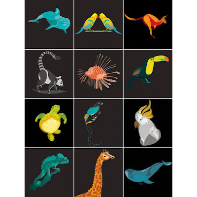 These are some of my animals that were inspired.


Subscribe to:
Posts (Atom)